1. Text Field
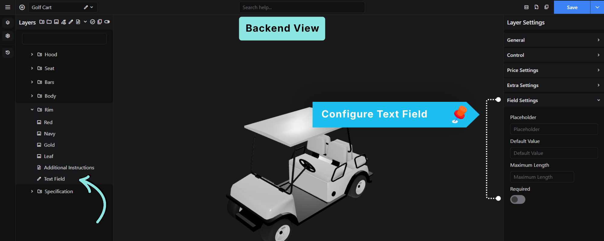
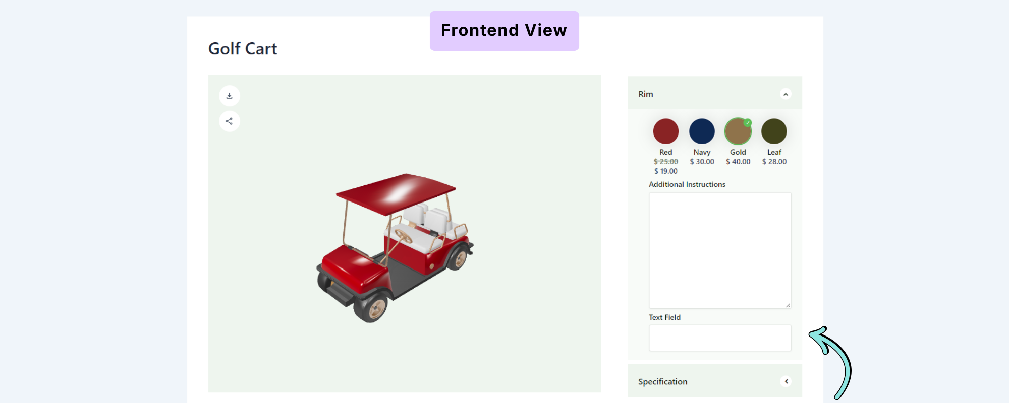
The Text Field allows customers to enter a short, single-line text value.
Add a Text Field
Select the Text Field option from the Custom Input Field tools. The field will be added to the Layers list.
Select the Text Field to open its settings in the Layer Settings panel.
Field Settings
The Text Field includes the following settings:
Placeholder
Enter text that will be displayed inside the field before the customer enters a value.
For example:
Enter your name
Default Value
Enter a value that should appear in the field by default.
Maximum Length
Set the maximum number of characters that the customer can enter.
Required
Enable this option if the customer must enter a value before continuing.
2. Textarea
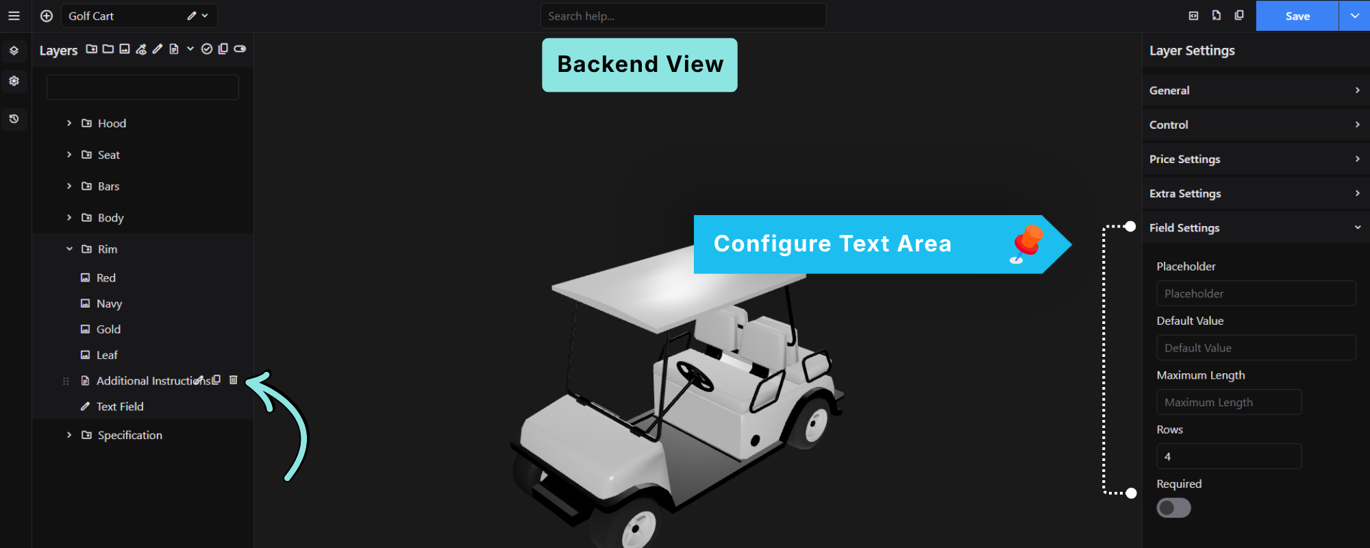
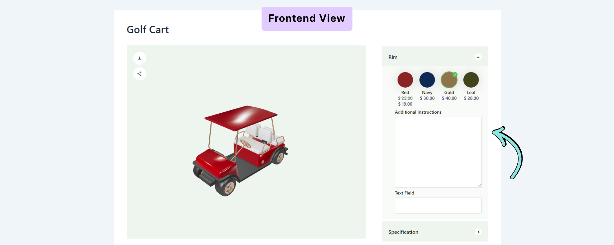
The Textarea allows customers to enter longer or multi-line text.
It is useful for collecting detailed information such as additional instructions, notes, or personalization details.
Field Settings
The Textarea includes the following settings:
Placeholder
Enter the text displayed inside the textarea before the customer enters a value.
Default Value
Set the value that should appear in the textarea by default.
Maximum Length
Set the maximum number of characters the customer can enter.
Rows
Set the number of visible rows displayed in the textarea.
For example, setting Rows to 4 displays a four-row textarea.
Required
Enable this option if the customer must provide a value.
3. Select
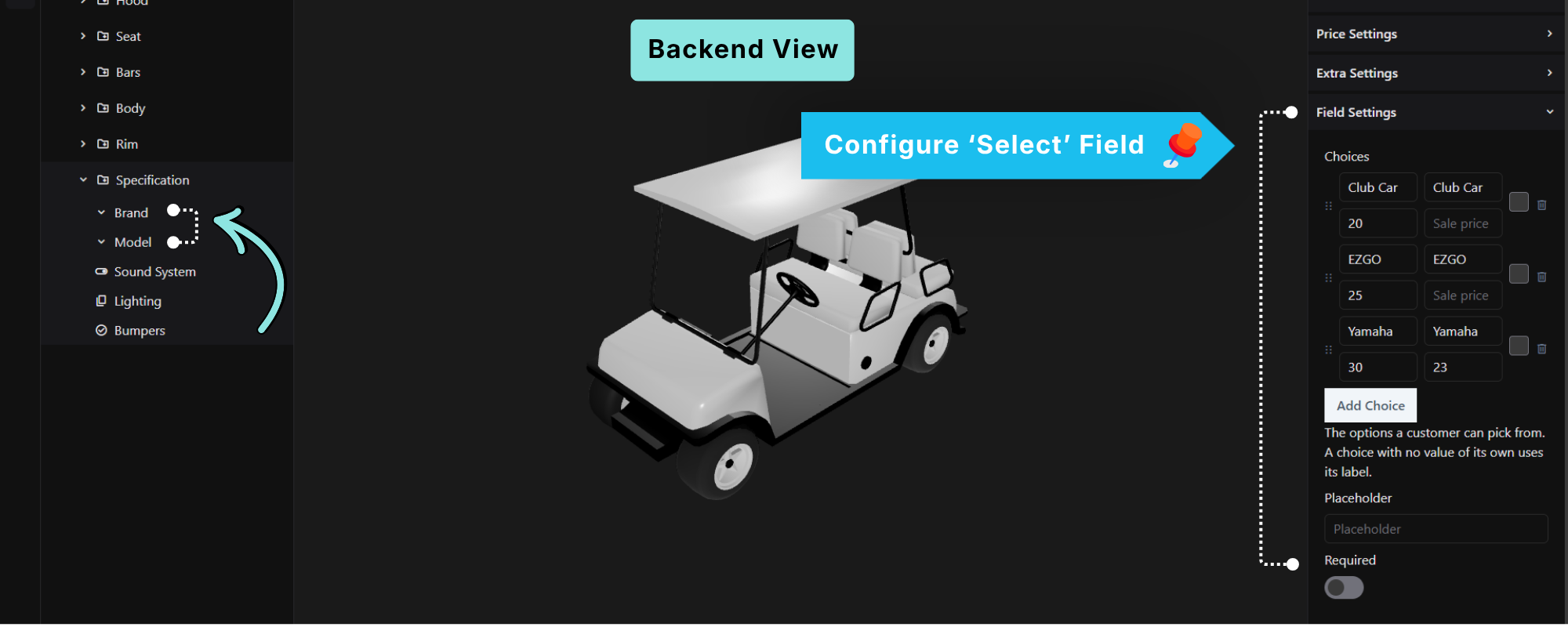
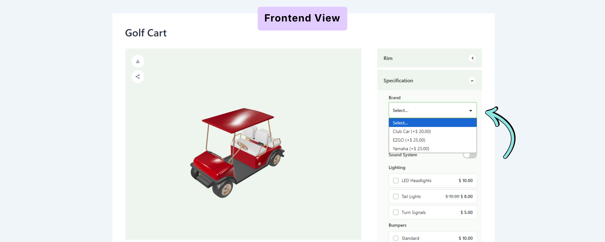
The Select field allows customers to choose one option from a dropdown list.
For example, you can use a Select field for:
- Brand
- Model
- Size
- Material
- Product type
Add Choices
Under Field Settings → Choices, click Add Choice to add the available options.
Each choice can have:
- Label – The text displayed to the customer.
- Value – The value associated with the choice.
- Price – The price associated with the choice.
- Sale Price – An optional discounted price.
You can add as many choices as required.
Tip: If a choice does not have its own value, its label is used as the value.
Placeholder
Set the text displayed before the customer makes a selection.
For example:
Select...
Required
Enable Required if the customer must select an option before proceeding.
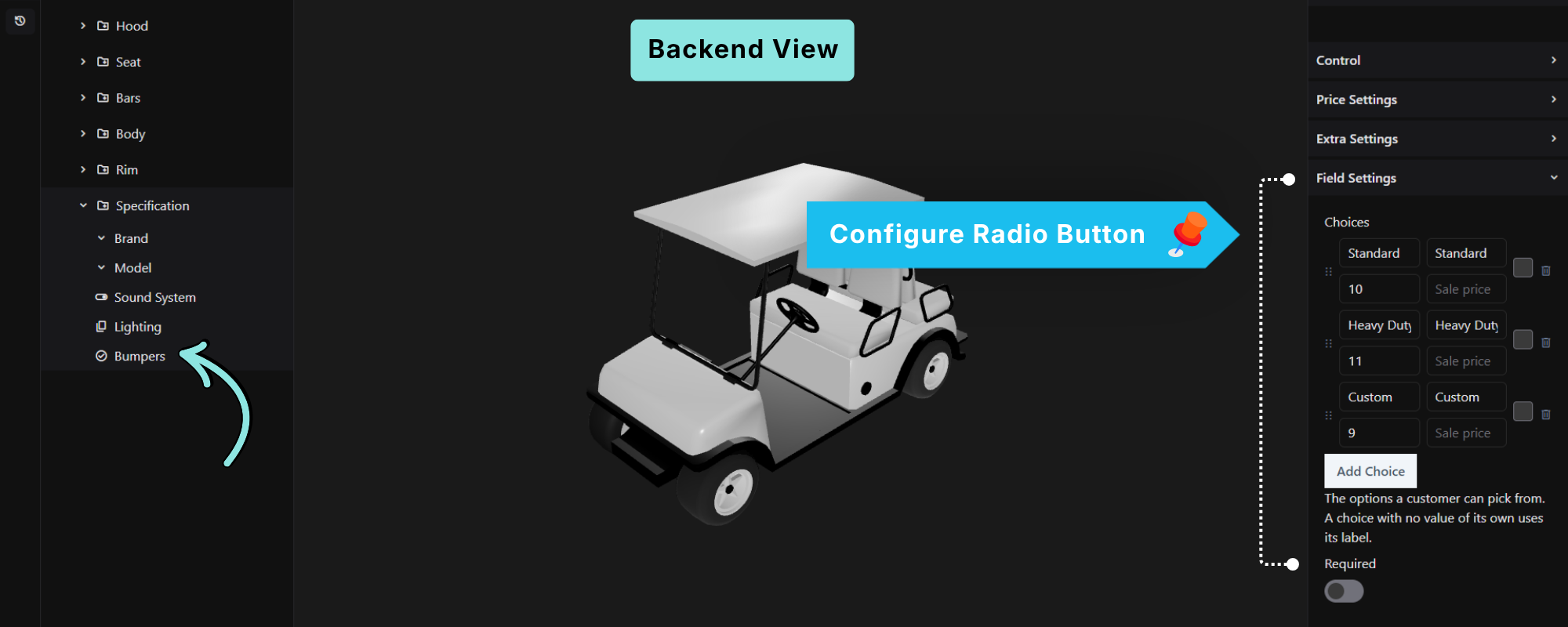
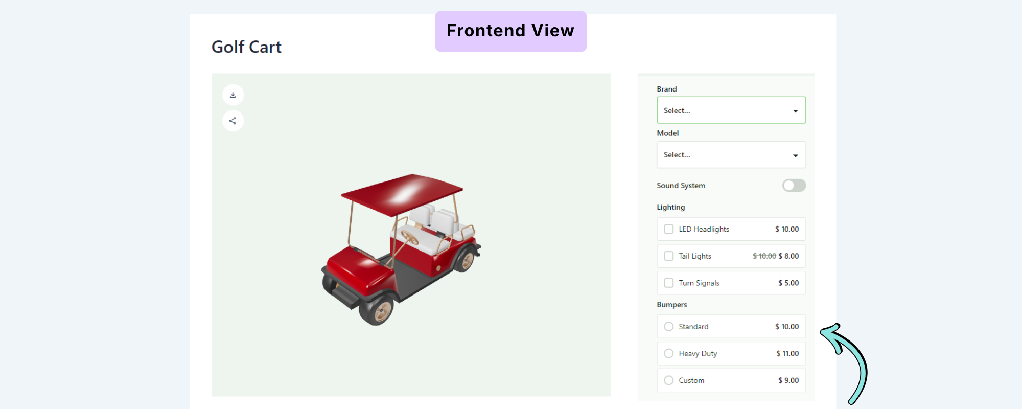
4. Radio
The Radio field allows customers to select one option from a list of visible choices.
For example, a Bumpers field could contain:
- Standard
- Heavy Duty
- Custom
The customer can select only one option.
Add Choices
Under Field Settings → Choices, click Add Choice to add options.
Each choice can include:
- Label
- Value
- Price
- Sale Price
You can also reorder or remove choices as needed.
Required
Enable Required if the customer must select one of the available options.
When to Use Radio
Radio fields are useful when you want customers to see all available choices without opening a dropdown.
5. Checkbox
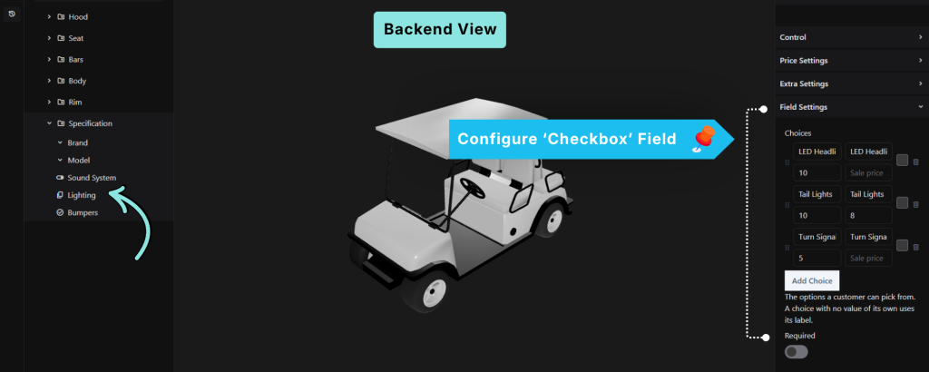
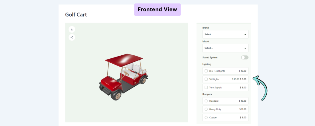
The Checkbox field allows customers to select one or more options.
For example, you can create a Lighting field with:
- LED Headlights
- Tail Lights
- Turn Signals
Customers can select multiple options at the same time.
Add Choices
Under Field Settings → Choices, click Add Choice to add the available options.
Each choice can include:
- Label
- Value
- Price
- Sale Price
Required
Enable Required when the field must have a selection before the customer can proceed.
When to Use Checkbox
Use Checkbox fields for optional features, accessories, or upgrades that customers can select independently.
6. Switch
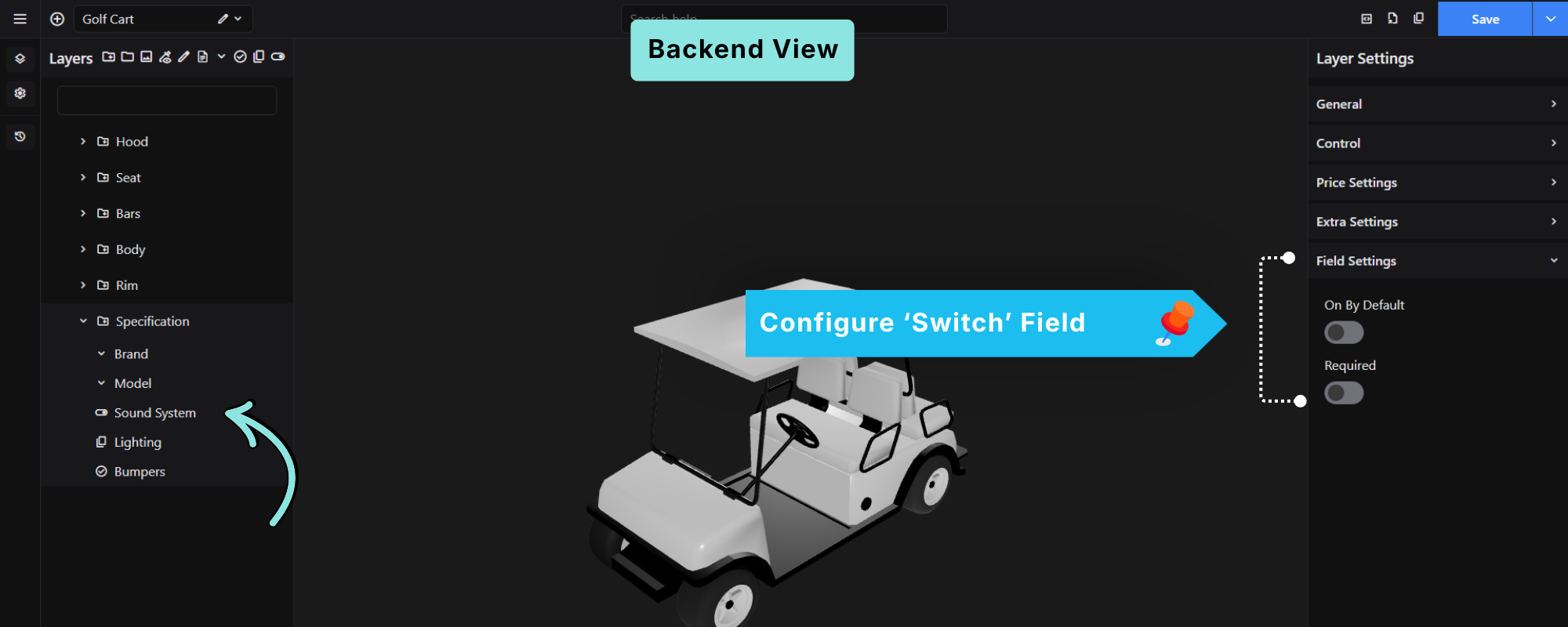
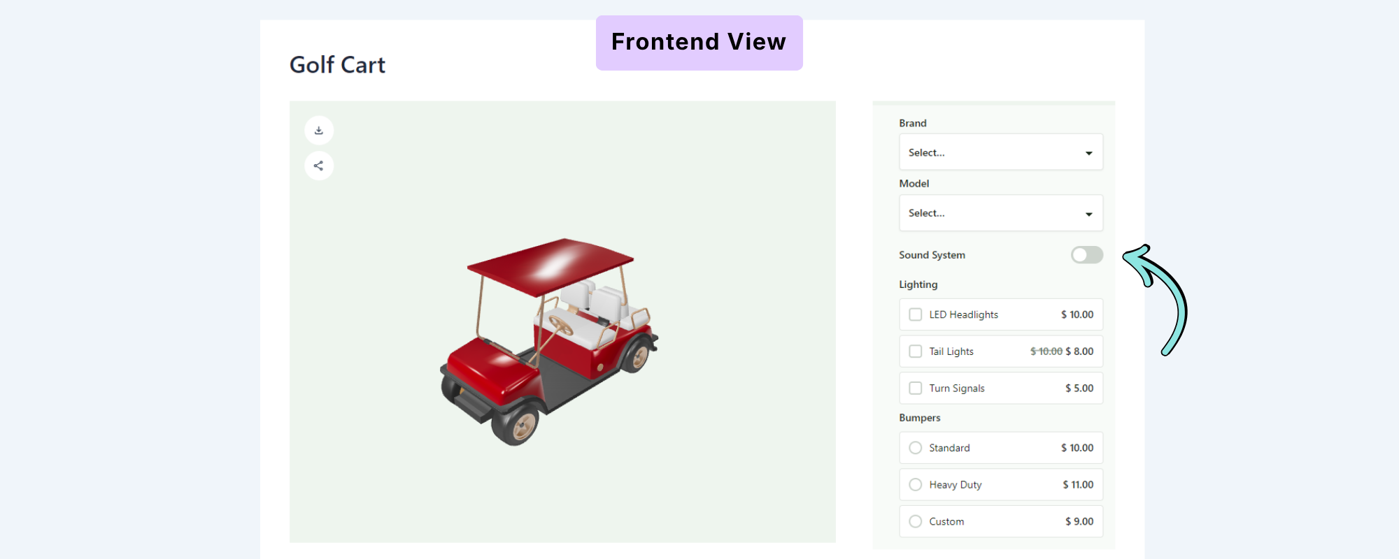
The Switch field provides an on/off toggle for a single option.
For example:
Sound System
OFF / ON
Customers can toggle the feature on or off.
Field Settings
The Switch includes the following settings:
On By Default
Enable this option if the switch should be turned on automatically when the configurator loads.
If disabled, the switch will be off by default.
Required
Enable Required if the customer must interact with the field before proceeding.