
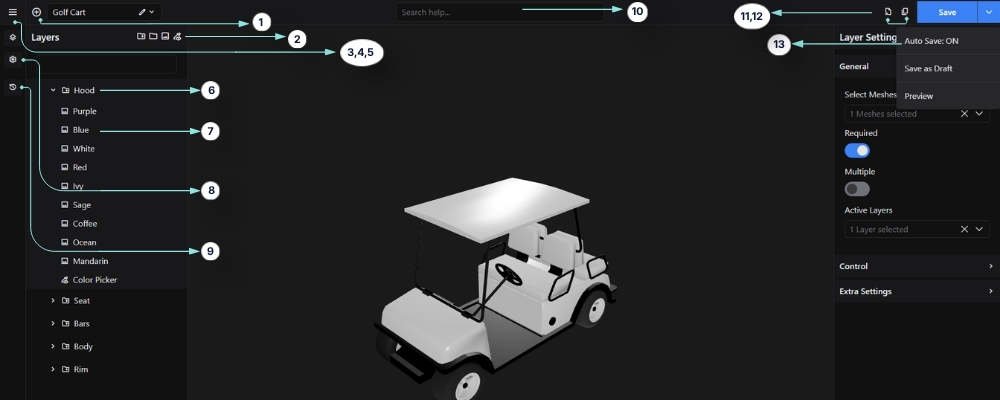
The WP 3D Configurator Editor is the central workspace where you build, organize, and manage interactive 3D product configurations. It provides a visual interface for controlling layers, assigning meshes, configuring materials, managing pricing, and customizing the overall customer experience.
Using the editor, you can create advanced product customization workflows with real-time 3D interaction, layered configuration systems, WooCommerce integration, pricing logic, and conditional option behavior. This guide covers all editor-related settings, panels, controls, and advanced configuration features available inside the configurator editor.
1. Add Layer
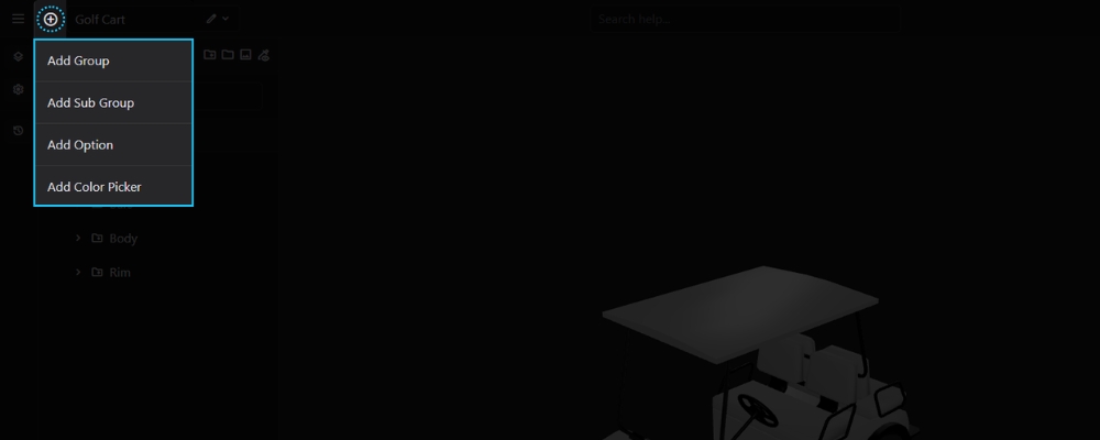
The Add Layer menu is used to build the structure of your configurator by creating new layers.
Opening the Add Layer Menu
Click the + button beside the configurator name.
Available Layer Types
From the menu, you can create:
Each layer type serves a different purpose within the configurator.
2. Color Picker Layer
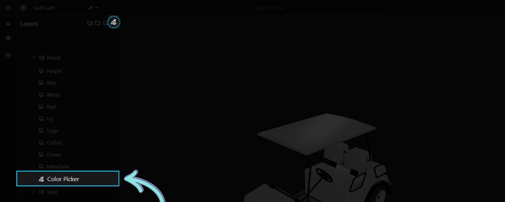
A Color Picker Layer allows customers to choose a custom color instead of selecting from predefined options.
Creating a Color Picker Layer
Open the Add Layer menu and choose Color Picker Layer.
Using the Color Picker
Assign the layer to the appropriate mesh and configure its settings. On the frontend, customers can select any supported color using the built-in color picker, and the selected color is applied to the assigned mesh in real time.
3. Exit to Dashboard
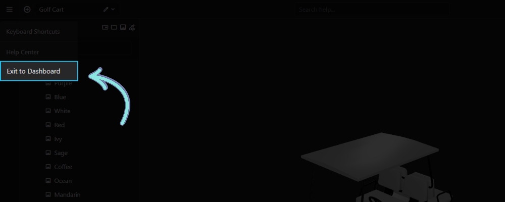
The Exit to Dashboard option closes the editor and returns you to the 3D Configurators dashboard.
Opening the Menu
Click the Menu icon in the top-left corner of the editor.
Leaving the Editor
Select Exit to Dashboard to return to the configurator list.
Tip: Save your configurator before exiting if Auto Save is disabled.
4. Keyboard Shortcuts
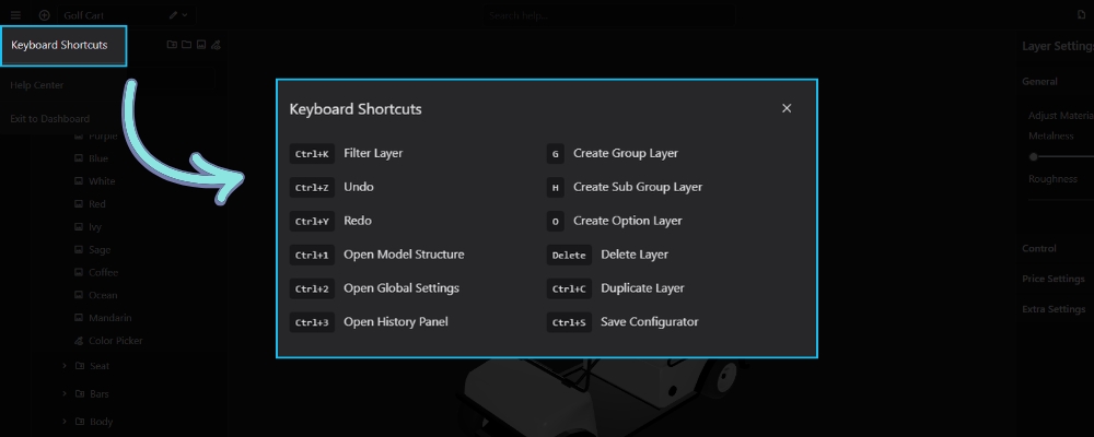
The Keyboard Shortcuts panel lists the available keyboard commands that help you work more efficiently inside the 3D Configurator editor. Using shortcuts can speed up common tasks such as creating layers, navigating the editor, and saving your configurator.
Accessing the Keyboard Shortcuts
Click the Main Menu (☰) in the top-left corner of the editor, then select Keyboard Shortcuts to view the complete list of available commands.
Available Shortcuts
| Shortcut | Action |
|---|---|
| Ctrl + K | Filter Layer |
| Ctrl + Z | Undo the last action |
| Ctrl + Y | Redo the last undone action |
| Ctrl + 1 | Open the Model Structure panel |
| Ctrl + 2 | Open Global Settings |
| Ctrl + 3 | Open the History panel |
| G | Create a new Group Layer |
| H | Create a new Sub Group Layer |
| O | Create a new Option Layer |
| Delete | Delete the selected layer |
| Ctrl + C | Duplicate the selected layer |
| Ctrl + S | Save the configurator |
Tip: Keyboard shortcuts work while the editor is active, allowing you to perform common actions without navigating through menus.
Related Documentation
History Panel – Track, undo, and redo changes made during editing.
Group & Sub Group Layer – Learn how to organize your configurator using groups and sub groups.
Option Layer – Create and configure selectable options.
Model Structure – Understand how meshes are organized in your 3D model.
Global Settings – Configure the overall behavior of your configurator.
5. Switch Configurator
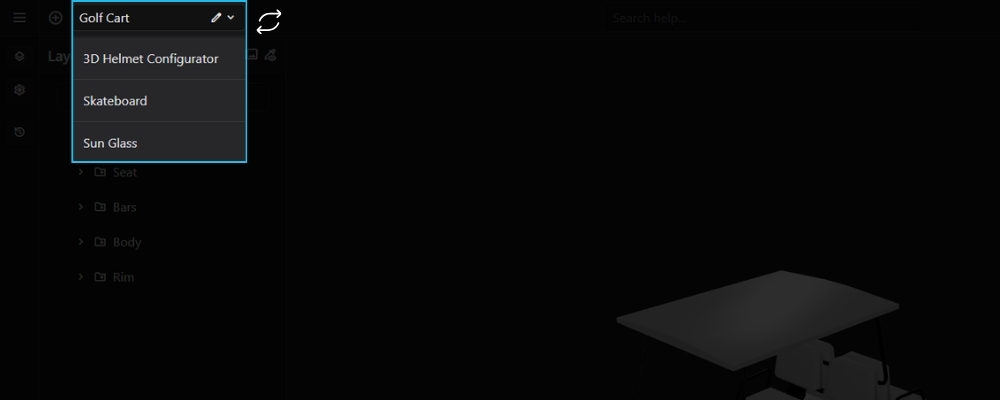
The Switch Configurator menu allows you to quickly open another configurator without leaving the editor.
Opening the Configurator List
Click the configurator name displayed at the top-left of the editor.
Switching Between Configurators
Select another configurator from the dropdown list. The selected configurator opens immediately, allowing you to continue editing without returning to the dashboard.
6. Group/Sub Group
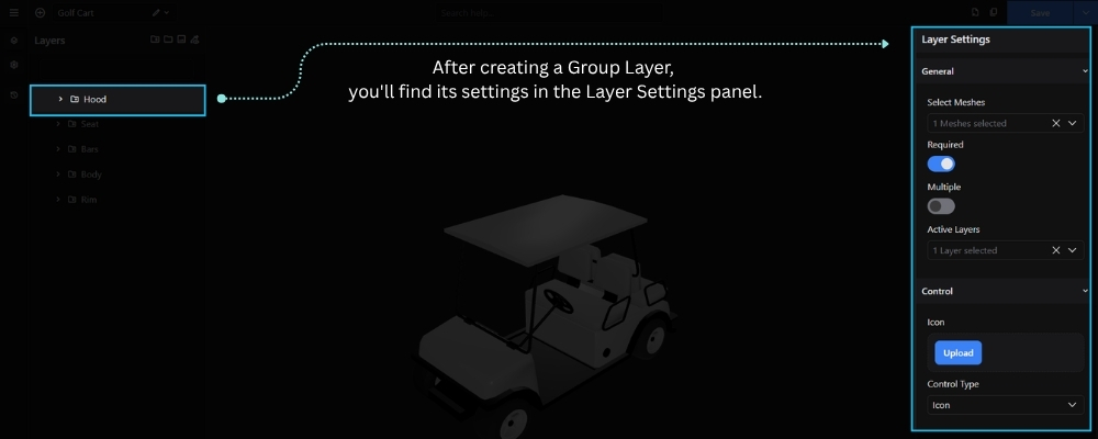
A Group/Sub Group defines a section of your configurator, connects it to one or more meshes in your 3D model, and controls how its options are presented to the customer.
To create a Group/Sub Group Layer, click the + button in the Layers panel or press G on your keyboard. After creating the group, configure its settings from the Layer Settings panel on the right.
The available settings include:
- Select Meshes – Assign one or more meshes from your GLB model that belong to this group.
- Required – Requires the customer to make a selection from this group before proceeding.
- Multiple – Allows customers to select multiple options within the same group.
- Active Layers – Automatically activate one layer whenever this group becomes active.
- Icon – Upload a custom icon to visually represent the group on the frontend.
- Control Type – Determines how the group’s options are displayed in the configurator, such as Icon, Image, or Text.
- Description – Add a short description to provide additional information about the group.
- CSS Classes – Assign custom CSS class names for additional styling or frontend customization.
Note: A Group/Sub Group Layer acts as the parent container for Option Layers. Each Option Layer represents a selectable choice that modifies the mesh assigned to the Group Layer.
7. Option Layer
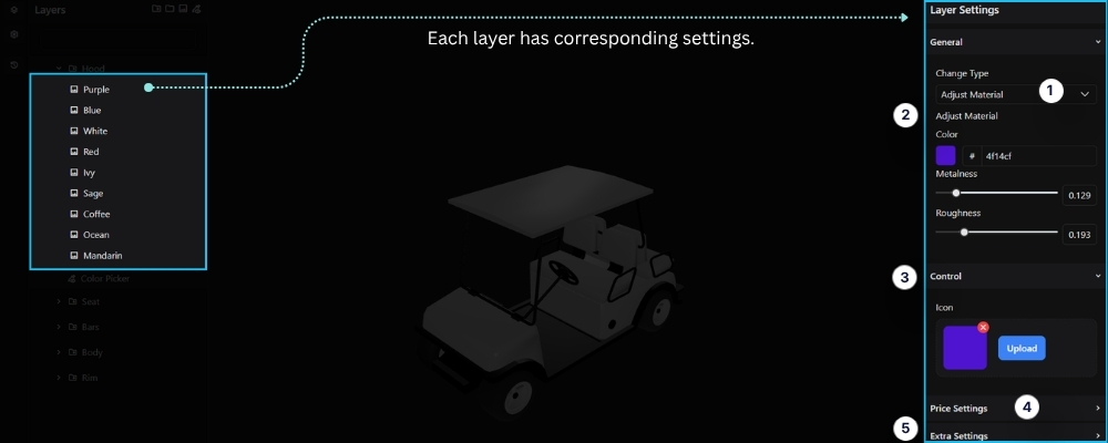
An Option Layer represents a selectable option within a Group/Sub Group. Each option is connected to one or more meshes in your 3D model and defines what happens when the customer selects it in the configurator.
To create an Option Layer, select a Group/Sub Group, then click the + button in the Layers panel or press O on your keyboard. After creating the option, configure its settings from the Layer Settings panel on the right.
The available settings include:
- Change Type – Determines how the option modifies the selected mesh. Available change types include:
- Swap Material – Replaces the current material assigned to the mesh with another material.
- Adjust Material – Modifies the properties of the current material, including Color, Metalness, and Roughness, without replacing the material.
- Swap Texture – Replaces the texture applied to the mesh while keeping the existing material.
- Swap Visibility – Controls the visibility of one or more meshes by showing or hiding them when the option is selected.
- Adjust Material – Configure the material properties of the selected mesh, including:
- Color – Choose the material color using the color picker or enter a hexadecimal color value.
- Metalness – Adjust how metallic the material appears.
- Roughness – Control how smooth or rough the material surface looks.
- Icon – Upload a custom icon to visually represent the option in the configurator.
- Price – Set the regular price for this option. The amount is added to the product price when selected.
- Sale Price – Set a discounted price for the option. When provided, the sale price is used instead of the regular price.
- CSS Classes – Assign custom CSS class names for additional styling or frontend customization.
Note: An Option Layer must be created inside a Group/Sub Group. The Control Type you choose determines how the option appears in the configurator, while the Active Layers setting allows a single selection to trigger multiple related layers automatically.
8. Global Settings
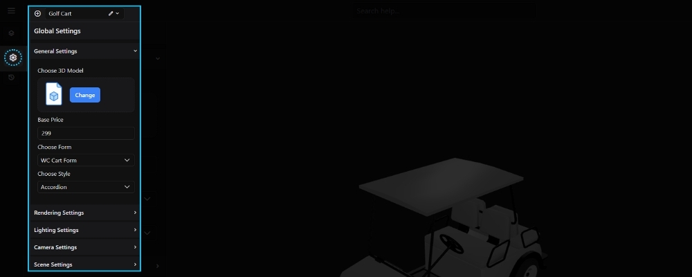
The Global Settings panel contains the main configuration options for your 3D Configurator. From here, you can select the 3D model, configure pricing, choose the form integration, customize the configurator layout, and adjust rendering and lighting settings.
Available Settings
- Choose 3D Model – Upload or replace the 3D model used in the configurator.
- Base Price – Set the starting price of the product before any additional options are selected.
- Choose Form – Select the form type to use, such as a WooCommerce Cart or Contact Form.
- Contact Form ID – Choose the Contact Form 7 form to display when using the Contact Form option.
- Choose Style – Select the layout style for displaying configurator options (e.g., Accordion).
Additional settings include:
- Rendering Settings – Configure the scene’s rendering quality, environment lighting, reflections, and overall visual appearance. Learn more in the Rendering Settings article.
- Lighting Settings – Adjust the ambient, main, fill, and rim lights to achieve the desired lighting setup. Learn more in the Lighting Settings article.
- Camera Settings – Configure the camera’s field of view and perspective to control how the model is displayed. Learn more in the Camera Settings article.
- Scene Settings – Customize the viewport background and adjust the scale of the 3D model. Learn more in the Scene Settings article.
Note: The available options may vary depending on the modules and integrations enabled on your website.
9. History
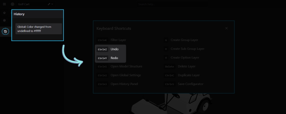
The History panel keeps track of changes made while editing your configurator, allowing you to review, undo, or redo previous actions.
Opening the History Panel
Click the History icon in the left sidebar.
Managing Changes
Every editing action is recorded in the History panel.
You can also use keyboard shortcuts:
- Ctrl + Z — Undo the previous action.
- Ctrl + Y — Redo the previously undone action.
This allows you to quickly restore previous changes while editing.
10. Search Help
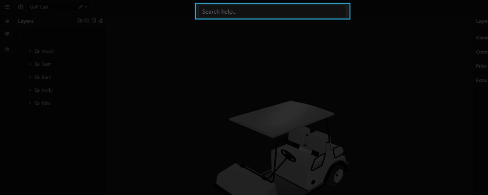
The Search Help field allows you to quickly search the documentation and help articles directly from the 3D Configurator editor.
Simply enter a keyword or topic related to the feature you need, and matching help resources will be displayed, allowing you to quickly find relevant documentation without leaving the editor.
11. Duplicate Configurator
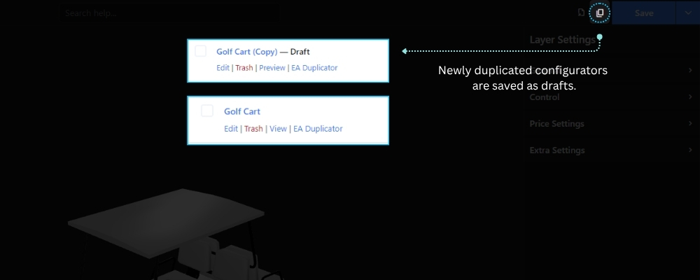
The Duplicate Configurator feature creates a complete copy of the current configurator, including all layers, settings, materials, pricing, and conditional logic.
Accessing the Feature
Click the Duplicate Configurator button in the top toolbar of the 3D Configurator Editor.
Creating a Copy
Click the Duplicate Configurator button to create a new configurator based on the current one. The duplicated configurator is created as a separate project, allowing you to modify it without affecting the original.
Note: The duplicated configurator includes all layers, pricing, materials, settings, and conditional logic.
12. Export Configurator
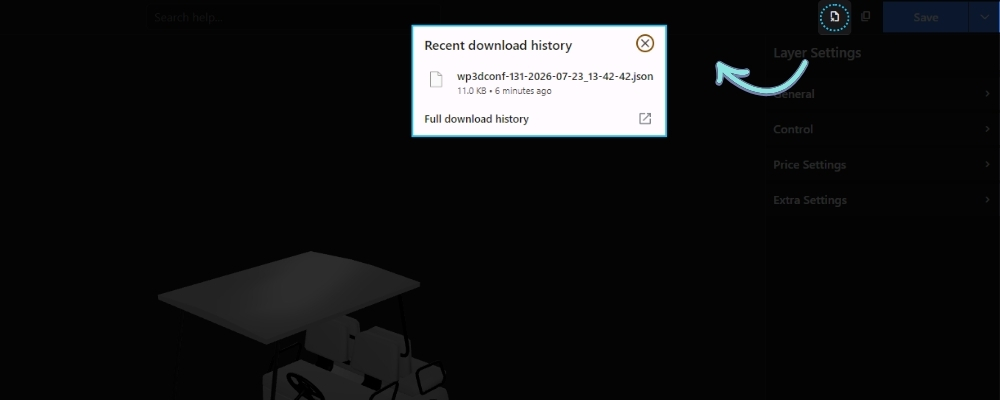
The Export Configurator feature downloads the current configurator as a JSON file, making it easy to back up or transfer your configurator to another website.
Accessing the Feature
Click the Export Configurator button in the editor’s top toolbar.
Exporting a Configurator
Click the button to download the current configurator as a .json file. The exported file includes the complete configurator structure, including layers, settings, pricing, materials, and conditional logic.
Related Documentation
13. Auto Save
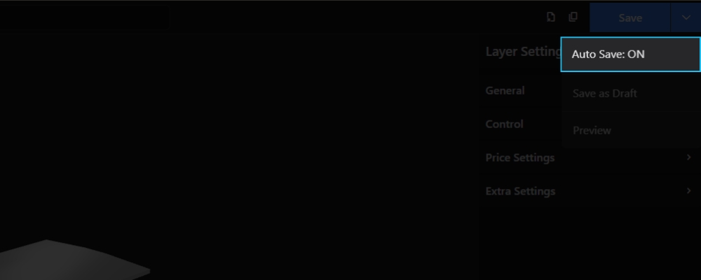
The Auto Save option automatically saves your changes while you work in the 3D Configurator editor, helping prevent the loss of unsaved work.
You can enable or disable Auto Save from the Save menu in the top-right corner of the editor.
- ON – Changes are saved automatically as you edit.
- OFF – Changes are only saved when you click the Save button.
Tip: Keeping Auto Save enabled is recommended, especially when working on large or complex configurators.